This design pattern is part of the LINC’s research initiative focusing on interface design. It comes from frequent proposals made by participants of the Data & Design workshops to implement the principle of transparency provided in the GDPR. It can be used and adapted to the specific context of your services and products. However, its reuse as such do not guarantee compliance with the GDPR in general and the principle of transparency in particular.
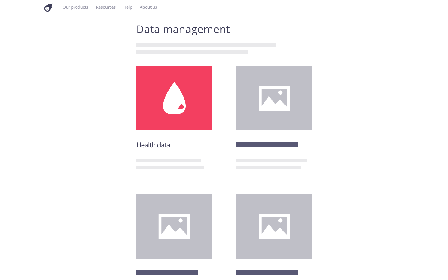
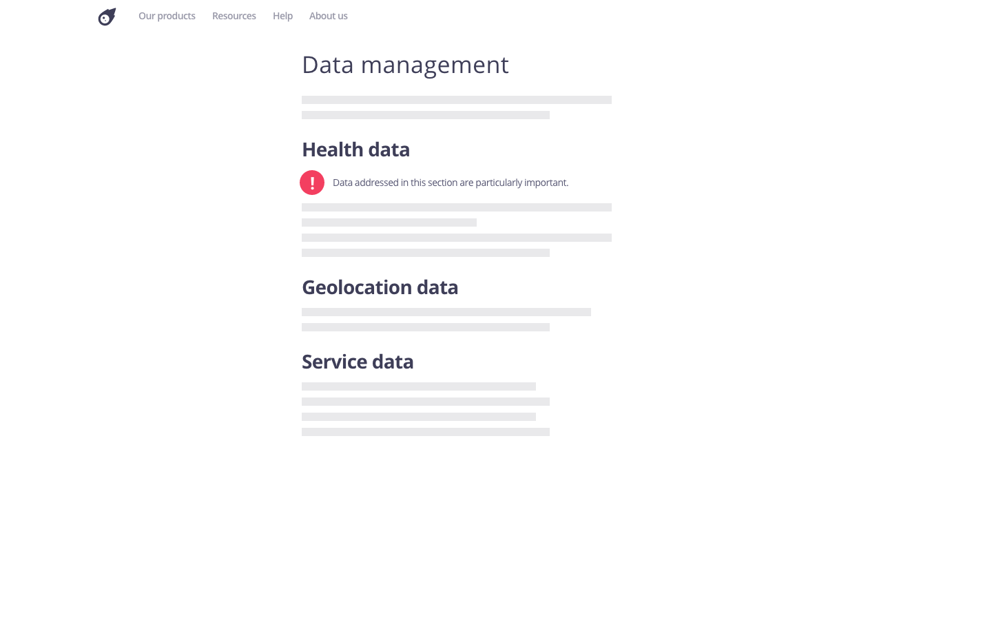
Icons, the use of which is proposed in Recital 60 of the GDPR, represent information in a visual and systematic way. They are generally used to highlight information deemed important, to indicate a specific type of information or to visually structure content.
They allow to quickly identify the elements dealt with in a section, or even in the service in general when a visual consistency is adopted.
Using the pattern in the user journey
► When signing-up: this pattern can be used to highlight requests or information that is important to individuals with regard to their personal data. For example, if consent is requested, an exclamation mark icon can be used to highlight the importance of the decision.
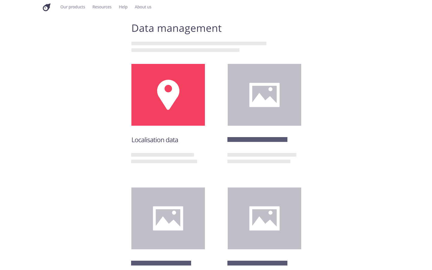
► In a privacy policy: this pattern can be used to complement the chosen structure with visual elements. For example, when a data structure is adopted it may be appropriate to associate each data type with a descriptive icon. It is also possible to highlight the key points of the policy, definitions or proposed examplesby using the same icon to indicate these elements.
► When using the service: this pattern can be associated with a given functionality of a service to make accessible explanations or means of control on the use of personal data. For example, when a targeted advertisement is displayed, a question mark icon may be added to provide further information about the underlying personal data processing and offer the possibility for the individual to withdraw consent. An icon can also be displayed when data is shared with a third party to alert the individual to this fact and thus inform them of the consequences of certain actions in the service.
► Lorsque l’utilisateur paramètre ses préférences : this pattern is particularly suitable for visually presenting the different sections or settings of a dashboard. For example, in the case study Konect, icons visually detail and highlight the settings of the application. Their colour depends on the section of the dashboard to which they belong.
Tips
► The effectiveness of icons is based on the cognitive background of the user. For example, the icon representing a character generally corresponds to the user’s “account”. Icons that are too specific to a service or overloaded may instead create confusion. Thus, icons should be designed and implemented in such a way that they accurately reflect what they represent using known code to not mislead people.
► Icons cannot replace textual information, which must be written in plain language. They complement, enrich and help to understand it, but people must be able to access all the information using text only, for purposes of accessibility;outes les informations uniquement avec du texte, dans un souci d’accessibilité.
► Using a multitude of icons can become counterproductive by visually overloading the textual information.
► It is recommended to keep consistency between the different icons by using the same icon library.
► According to §8 of Article 12 GDPR, data protection authorities such as the CNIL may propose standardised icons to express aspects of a data processing operation. It may be relevant to stay informed about these possible proposals in order to align an existing iconography with the one made available by a data protection authority.n des données.
Examples
Possible approach
Possible approach
Attention point
