Konect is a social network providing a messaging system and is very popular among teens to share pictures and videos.
This case study is part of a LINC research initiative focusing on interface design. Cases dealt with are fictional services co-created with the participants of the Data & Design workshops. The solutions considered here are not intended to be recommendations to copy, but rather contextual illustrations of creative processes that might inspire your services and products. The study does not cover the entire user experience, but simply concentrates on key points. As such, it does not necessarily cover all GDPR requirements.
This case study is the result of a co-creation process with about thirty children and teenagers, as well as their parents, which took place between October and December 2020. Focus groups were first carried out to understand and measure the minors’ use of digital tools and to assess their knowledge of personal data protection. Workshops with these minors were then conducted to design interfaces based on their experiences and daily uses. These interfaces were then tested with other children to get a first impression of their reception.
Product’s Context
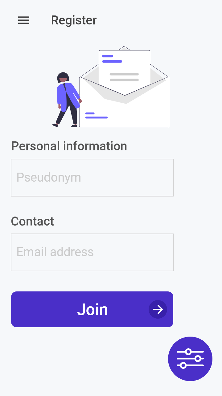
Konect is a fairly traditional social network, focusing on interactions between small groups of friends rather than public, global interactions. To use the service, the user must create an individual account.
When registering for this type of service, minors seem to pay little attention to the information they are asked for, as they assume that they cannot make any choice. This impression persists throughout the use of the service, leading minors to rarely look into setting up their personal data preferences or the exercise of their rights. This phenomenon is reinforced by the fact that, as the focus groups revealed, minors are generally unaware of their rights regarding their personal data and do not really know how to exercise them or sometimes confuse their exercise with other features of the service.
In this context, how can we enable minors to regain control of their data by making it easier for them to exercise their rights through interfaces that use the codes they know?
User pathway and key steps
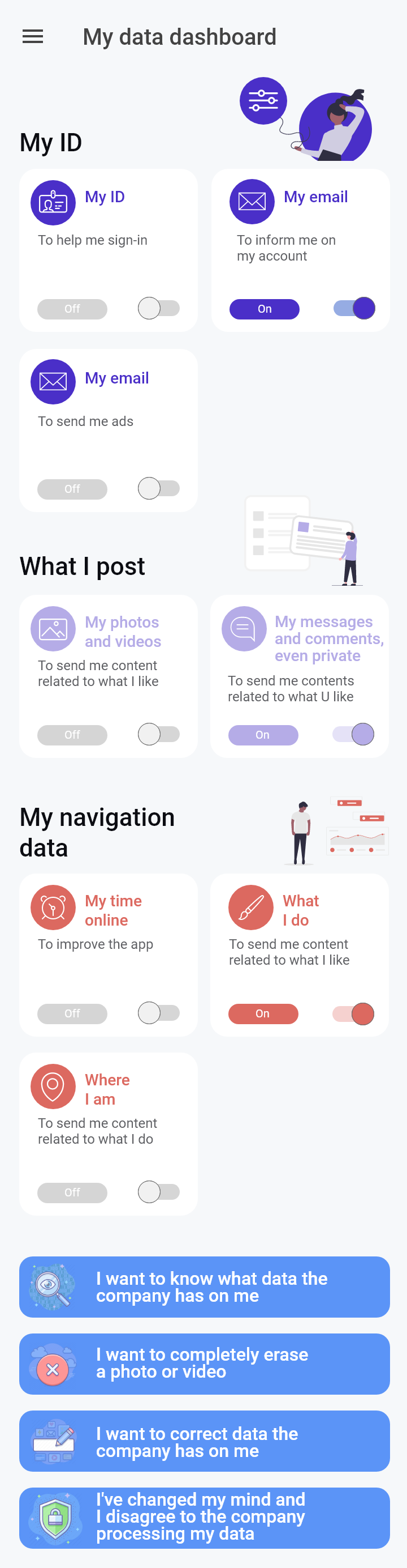
Often, an identification or registration step is required to access and play a game. The participants of the co-creation workshop went for a dashboard approach. They developed it by focusing on three aspects:
- centralising all the parameters on data and rights related to the service, thus avoiding convoluted situations to find them and giving a fixed and easily identifiable point of reference for the person when she wishes to control her data;
- easing the interactions with the different options available in the dashboard to facilitate as much as possible the control of the data while minimising the frictions of use;
- simplifying as much as possible the exercise of a right by means of dedicated, easy-to-fill forms.
A single place to control their data
The participants considered that the main interest of a dashboard is that it is accessible at any time, in a stable manner over time. Its existence can be mentioned on the registration page, then it can be accessible at any time during the use of the service, for example through a “dashboard” icon or a link in the footer. The participants, in agreement with the results of the focus groups, also considered that this place of reference for controlling one’s data should keep the graphic identity of the service. They accordingly adopted the graphics and interaction used on the Konect social network in the design of the dashboard.
Proposed Approach
Balance between clarity and conciseness
Furthermore, the participants were careful to avoid any risk of information overload, an important pitfall in a dashboard that aims to bring together all the means of action on personal data. The tests conducted with minors validated this intuition. Teens indicated that too much written information was detrimental to their reading, preferring each screen to contain very little text coupled with buttons that were totally obvious at first glance.
Even if the text is scarce, participants took care to make it particularly clear and easy to understand for teens. Some suggested using different terms for different ages, as younger people prefer concrete language and references to familiar concepts (e.g. school, social networks rather than administrative vocabulary), which might seem less relevant to 17 years old.
In the end, the interface proposed to gather data that can be configured into three categories, in addition to buttons dedicated to rights. For the categories, the participants used terms referring either to the nature of the information (such as commonly understood identification data) or to the way it is generated (such as data voluntarily put online by the minor). Each data present in a category is associated with a briefly explained purpose and the push button allows each of them to be simply activated or deactivated. By default, all the options are deactivated and it is the teenager who activates the ones she wants, in this case the sending of personalised content. The same logic is applied to the different buttons for exercising rights, combining information with action. Rather than talking about the “Right of Access” the participants explained it by using an action verb “I want to know what data the company has on me”.
Proposed Approach
Exercising one’s right made easy
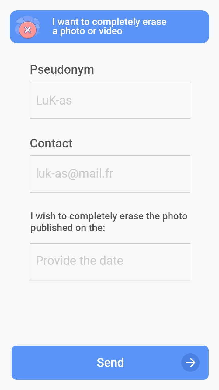
Going further than the dashboard itself, participants also thought about what would happen once a right exercise button was pressed. They imagined that each one would redirect to a form dedicated to the right activated, rather than proposing to send an email to the legal entity responsible for handling this type of request. They also proposed to pre-fill the specific request related to the right to help the young person to formulate it properly.
Once the form has been submitted, the application should keep the user informed of the progress of the application. Minors do not use email as a communication channel, so it is better to send notifications directly from the application – where they can access them more easily.
Proposed Approach
Limitations
Tests were carried out for this dashboard interface with minors aged 8-17 and revealed that the interface was generally well understood and found to be useful. Even though under-13s are not supposed to use social networks, including them in these tests showed some of the pitfalls of such a generalized data management interface. In particular, the 8-10 years old found it too busy and with too much information making it difficult to use. It would therefore seem appropriate to create an interface dedicated to this age group in the context of other services and applications that would concern them directly. Furthermore, if a large amount of settings is available to the user, the dashboard could quickly become too complex to understand because it offers too many choices to the user. In this case, the interface and navigation paths of the panel would have to be adapted.