This design pattern is part of the LINC’s research initiative focusing on interface design. It comes from frequent proposals made by participants of the Data & Design workshops to implement the principle of transparency provided in the GDPR. It can be used and adapted to the specific context of your services and products. However, its reuse as such do not guarantee compliance with the GDPR in general and the principle of transparency in particular.
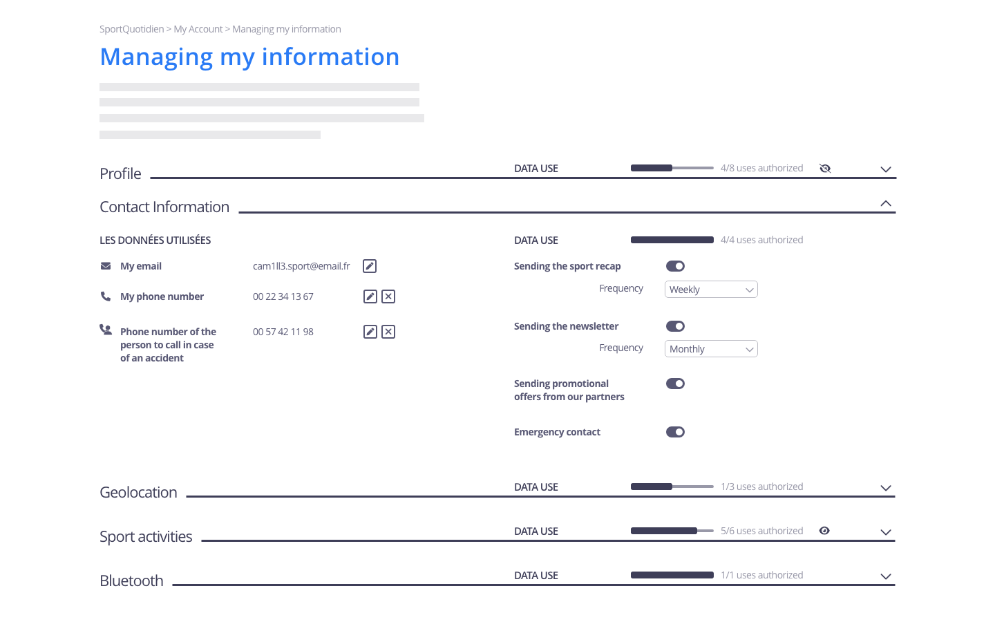
A dashboard groups and organises in a single space all the actions available relating to personal data protection (settings, consent, exercise of rights). Individuals thus have easy control over their data as they can go to a single place to set their preferences.
Using the pattern in the user journey
► When signing-up: if an onboardingis implemented in the service, a screen introducing the dashboard can be integrated. It can describe the purpose of the dashboard, provide a link to it, indicate where to find it in the interface, etc.
► In the case of a problem with the data or their use: en a person realises that the processing of their data does not correspond to their expectations, the dashboard is of invaluable help to regain control over their data and their use. Indeed, they immediately know where to look to check and change their preferences or to exercise their rights, and so don’t have to dig through various pages scattered throughout the service.
► When setting one’s preferences: this pattern is by definition most relevant in this case. In the case of complex data processing, particular attention should be paid to the way in which the different setting options are categorised and presented to ensure that each one is easy to access, especially if multiple levels are created. Working with users is relevant, if not essential, to designing a dashboard.
Tips
► A dashboard is only effective if it is exhaustive and includes all controls associated with the account and services used by the user. A partial dashboard where some operations cannot be performed via the dashboard should be avoided.
► Even if it centralises all actions related to personal data, the dashboard can be composed of several pages or tabs. This should be considered in relation to the complexity of the processing implemented and the clarity to be provided to people. Indeed, it is important to avoid making navigation complex and time-consuming, in particular by multiplying the number of clicks required to perform certain actions.
► The most common, looked for or particularly important settings can be prioritised for easy access; conversely, such settings, such as disabling profiling, whether advertising or not, should not be hidden.
► Complex data processing can lead to a great deal of granularity in the choices available to people. It is important to make these choices clear while allowing individuals to make granular adjustments of their data. This is particularly true when someone gives or withdraws their consent.
► When an account is associated with several terminals, people expect the dashboard to be accessible on each of them so that the settings can be modified from all of them. However, specific settings for each terminal should always be offered.
► The different elements of the dashboard should follow existing good UI practices. This is particularly important when a push button is used: its status (enabled / disabled) should be clearly visible and understandable. For this, it is recommended to use grey colours for the push button when the option is disabled and to colour it when the option is enabled. Using feedback when the person interacts with an option is also a good practice to confirm the result of the action taken;
► Icons can be used, for example, to indicate data types.
► For each available control, information can be linked to it in order to make transparent the usefulness of the control and the expected effects.
► Because it provides access to many settings and data, the dashboard must be particularly secure. Where possible, two-factor authentication of the user wishing to access the dashboard is recommended.
Examples
Possible approach
Related patterns