Information de retour
This design pattern is part of the LINC’s research initiative focusing on interface design. It comes from frequent proposals made by participants of the Data & Design workshops to implement the principle of transparency provided in the GDPR. It can be used and adapted to the specific context of your services and products. However, its reuse as such do not guarantee compliance with the GDPR in general and the principle of transparency in particular.
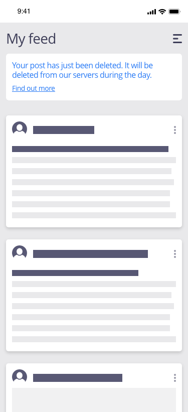
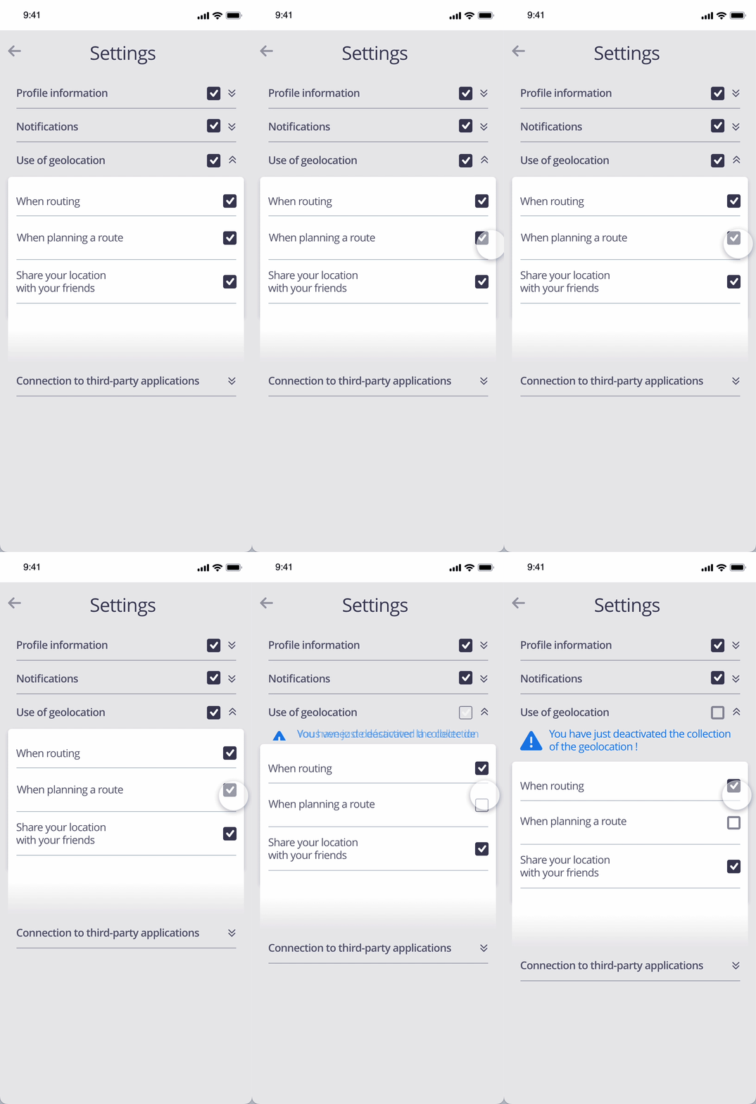
This pattern corresponds to a good interaction design pratice, which indicates to the person the result of the action just undertaken through a message and/or a visual signal. In general, this information confirms the result of the action or, on the contrary, warns of the occurrence of an error.
The feedback makes it possible to guide the person in carrying out his actions in relation to his personal data. It reassures that the service has considered their data. It is particularly valuable when an action cannot be carried out, for example because of a technical error, as it indicates the other means available to carry out the desired action. It can also be an opportunity to provide educational information following a person’s action.
Using the pattern in the user journey
► When signing-up : this pattern can be used at registration time to dynamically return certain conditions necessary for registration, for example to indicate whether the password entered includes all the required character types and the minimum number of characters. This information is updated as the person enters the password, guiding the person through the creation of the password and allowing them to quickly know whether or not all the conditions are met.
► When using the service : this pattern may be relevant to use in connection with certain service functionalities in order to inform in a situated and contextual way about the use of the associated data or about the consequences or effects of an action. For example, a fixed icon can be displayed in the status bar of a phone when using an application collecting specific data such as geolocation. This pattern can also allow for the provision of preference management actions to the individual. This is for example what cas study VoDocumentaire does with the deposit of cookies by visually representing the cookie necessary for the service to remember the basket following an action by the person in the interface.
► In the case of a problem with the data or its use : in this type of situation, it is possible that the person will search the various resources on the site to understand and resolve the situation. If a search bar is used in a help centre dedicated to the management of personal information, the feedback information is particularly recommended when no results are found for the search entered by the individual to redirect the individual to a source of information such as the privacy policy using a message such as “No results were found. We recommend that you consult the privacy policy”.
► When setting one’s preferences : this pattern is very useful when the person sets their data preferences, for example through a dashboard. It allows to give relevant information after the action has been performed, such as displaying a message after exercising a right confirming that the request has been taken into account.
Tips
► The information presented through this pattern should accurately reflect the consequences of the action taken by the person and not induce doubt about them.
► It must also be consistent with the service as a whole (information available, redirection to existing pages, etc.).
► In addition to informing the user of the consequences of the action, other related actions may be made available. For example, a person who has changed the visibility of one of his workstations may be offered the opportunity to review all of these settings.
► This approach should not be used in such a way as to challenge the individual’s decision to choose or keep a less protective setting for their data, which would then become a manipulative design (deceptive design pattern). Conversely, this pattern can be used to alert the person about a choice they have made that may involve risks to their data and privacy. For example, if the person changes the visibility of their profile on a social network to “Public”, a confirmation message after they validate the choice stating “By changing the visibility of your profile, everyone will be able to see it on our network and the Internet in general. Are you sure?” is appreciated.
► If a notification system is available in the service, feedback information can, in some cases, be conveyed through a notification.
Examples
Possible approach

Point of attention (animation)


