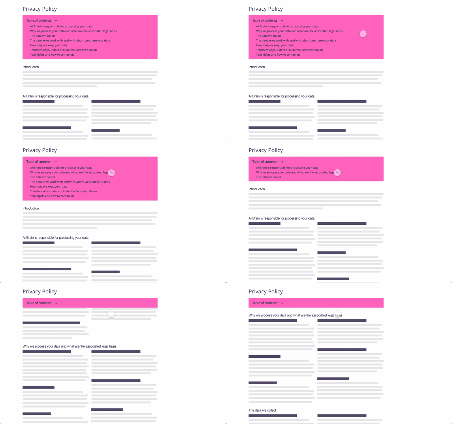
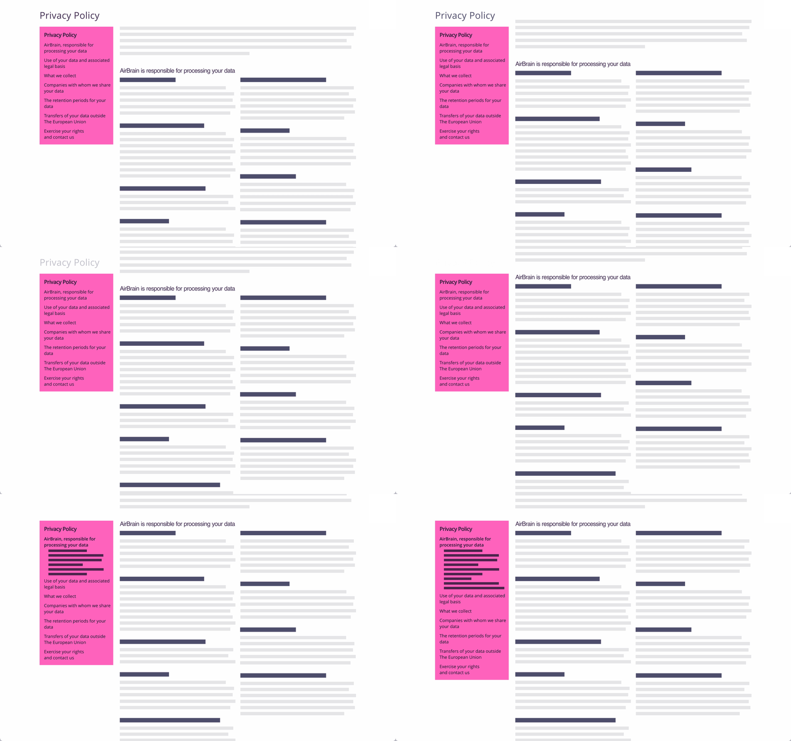
Table of contents as a browsing menu
This design pattern is part of the LINC’s research initiative focusing on interface design. It comes from frequent proposals made by participants of the Data & Design workshops to implement the principle of transparency provided in the GDPR. It can be used and adapted to the specific context of your services and products. However, its reuse as such do not guarantee compliance with the GDPR in general and the principle of transparency in particular.
This pattern is mainly used in a privacy policy. It includes all the section headings in the form of a navigable menu. In this way, each title is clickable and scrolls the page to the corresponding policy section.
This approach allows people to simply read the overall structure of the policy. This helps to find quickly the parts providing the searched information and to access it with one click. This table of contents, if fixed, makes it easier to navigate through the policy.
Tips
► When this pattern is used, the titles of the policy must be designed to be clear and explicit about the associated content. Indeed, titles that are too vague or redundant will not allow the person to know where the different informations are located and therefore to be directed.
► A reflexion must be carried out to the level of granularity to display in the navigable table of contents. Indeed, if the policy has many parts and sub-parts, the table of contents may be very long and tedious to explore.
► In the case of a long privacy policy with many parts, it may be appropriate to leave the table of contents always visible and to display the sub-sections dynamically depending on the progress of the reader. In this way, readers always has an overview of the policy, they can navigate more precisely within a section, knowing where they are in their reading process with the help of visual cues (e.g. highlighting of the part being consulted).
► With this pattern, it is important to ensure that people understand that the different headings are clickable. This can be done by re-using the style already used in the rest of the service for links, a good practice being to underline them.
► Special attention should be paid to this pattern in the case of mobile display. In such a case, because of the limited display space of the screen, the browsing menu cannot be displayed continuously. A simple means of access must be considered, for example by clicking on an icon.
► This pattern can be associated with browsing arrows that allow to move from one section to another section displayed in the table of contents when it is fixed in the interface.
► This pattern can be associated with a search bar, allowing the relevant section to be found using keywords.
Examples
Possible approach (animation)

Possible approach (animation)


