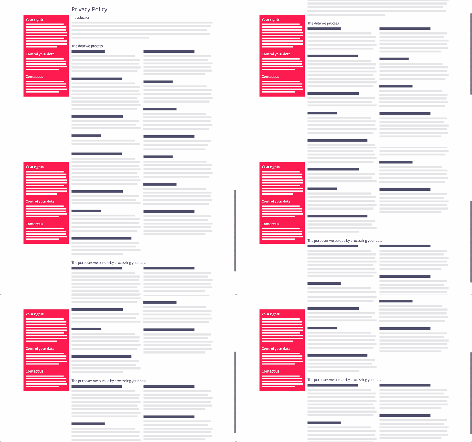
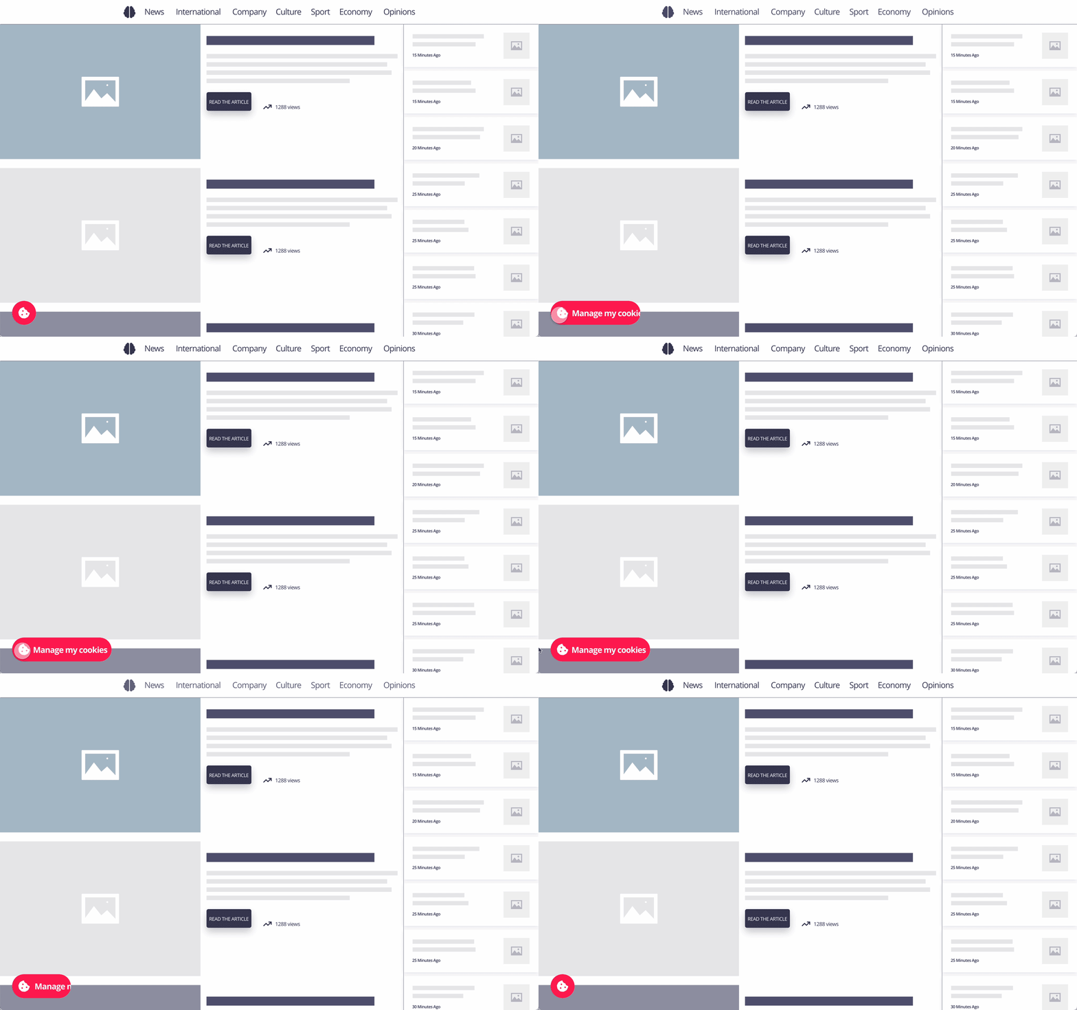
This design pattern is part of the LINC’s research initiative focusing on interface design. It comes from frequent proposals made by participants of the Data & Design workshops to implement the principle of transparency provided in the GDPR. It can be used and adapted to the specific context of your services and products. However, its reuse as such do not guarantee compliance with the GDPR in general and the principle of transparency in particular.
This pattern proposes to permanently and fixedly display in the interface a piece of information or an action that is deemed particularly important for the protection of personal data. This wa it becomes visible and accessible at all times.
Using the pattern in the user journey
► In a privacy policy : this pattern can be used inside of a privacy policy in a variety of ways, such as combining it with a table of content as a browsing menu or attaching certain important informations, either to the whole privacy policy or specifically to a section such as a contextual summary. It can also be used to highlight specific actions related to the policy, such as downloading the policy in an offline format.
► When using the service : this pattern may be useful to provide a quick way to access information or to set up an item. For example, it may apply to accessing the setting of cookies preferences through a fixed icon available in a corner of the page. Another example, in a mobile environment, is an icon in the status bar that can be used to signal the active sharing of data. In the same spirit, an application using geolocation could use this pattern to allow quick access to a dashboard or a settings page allowing control of this data.
► When setting one’s preferences : depending on the context, this pattern can be used in different ways. For example, if the user is on a page explaining rights, a fixed element may be present providing a simple way to exercise them and indicating the address of the DPO. In the case of a personal data breach (e.g. users accounts login copied and made public) it is possible to use this pattern, for example by using a notification, to display a fixed message at the top of the page alerting people of the incident and indicating the actions they can take to secure their data (e.g. check login history and change passwords).
Tips
► If it is not relevant and does not answer a legitimate expectation of the person, the fixed element can clutter the page and degrade the user experience.
► Where information is fixed, care should be taken to use clear language and to keep it short, otherwise the element may be overloaded and the information contained may not be clearly distinguishable.
Examples
Proposed approach (animation)

Proposed approach (animation)


