VODocumentaire is a video-on-demand platform. The application enables its users to watch videos online or obtain digital copies to download.
This case study is part of a LINC research initiative focusing on interface design. Cases dealt with are fictional services co-created with the participants of the Data & Design workshops. The solutions considered here are not intended to be recommendations to copy, but rather contextual illustrations of creative processes that might inspire your services and products. The study does not cover the entire user experience, but simply concentrates on key points. As such, it does not necessarily cover all GDPR requirements.
Product’s context
VODocumentaire is a documentary streaming, rental and purchase service. Its “mobile first” approach enables users to watch videos at any time, including on public transport and during everyday travel. You do not need to have an account in order to use the service. However, this does not mean that VODocumentaire does not collect any personal data. In order to ensure that the service operates properly, it is obliged among other things to collect users’ contact and bank details, and a cookie for the shopping cart.
Such data is collected in numerous ecommerce sites to enable transactions to be made. However, some of it are also used to sustain a site’s economic model with direct support, in particular by using customers’ email addresses for marketing purposes. Given one kind of data can be put to different uses, it is essential to inform users fully on the ways in which their data will and may be used.
This being so, how do you include steps in the user pathway that enable data subjects to fully understand their personal data flows and make informed choices on its use?
User pathway and key steps
The VODocumentaire team approached the problem by questioning the classic shopping tunnel journey by adding new steps and features enabling users to make specific choices on the ways that their data is processed or informing them on how their data is used.

These features include:
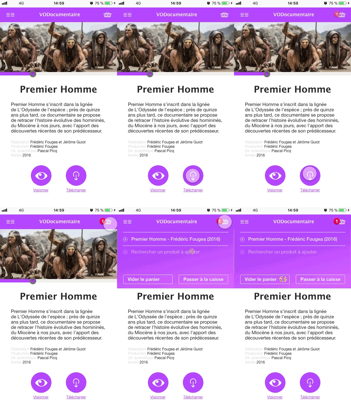
- making data collection visible in real time by making operations, such as storing cookies on the user’s device, apparent visually. Such transparency approach provides users with better understanding of the service’s operation and enables them to understand how to keep control over their data. It also provides an opportunity to include actions connected with exercise of rights (right of access, right to object, etc.).
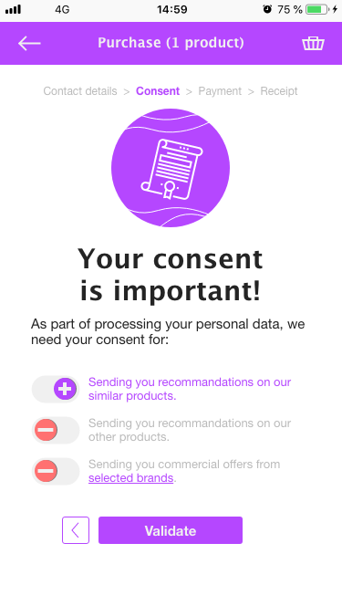
- highlighting the collecting consent step in the user experience (by making the purchasing process a key step), so as to make users aware of the importance attached to their privacy and create relationships of trust with them.
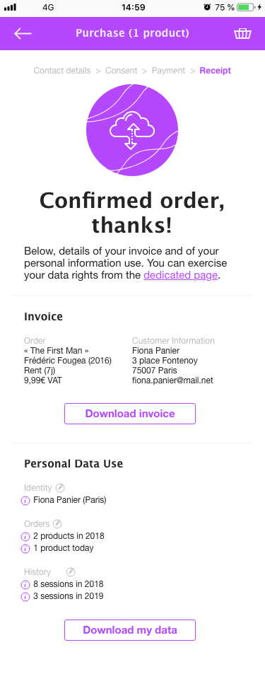
- facilitating exercise of rights during and after the act of purchase by letting users know what data is collected on them and enabling them to recover or erase information collected.
Shopping cart and cookies
The workshop participants dealt first with an essential functionality of a ecommerce website: the shopping cart, which requires placement of a cookie in order to operate.
This kind of cookie is exempt from consent inasmuch as they are “necessary for the provision of a service explicitely requested by the user” (fr). However, participants wanted to take a transparent, educational approach that made visible the storage and use of a cookie for the shopping cart. The participants aimed for the users getting familiar with the service’s working by making it visible. It is indeed through contact with services’ inner workings that users become progressively aware of their operational rationales and so keep better control over their data.
As well as providing a graphic symbol when the cart is created during selection of a first documentary, participants highlighted the consequences that various shopping cart might have on the cookie.
Proposed approach

In this example, clicking on a product triggers an animation showing a cookie being deposited in the cart. To go further, you can provide extra information explaining that emptying your cart deletes the related cookie. Here, the animated cookie shows this.
A special step for consent
To move away from the classical model of collecting consent, in which it is presented as an action of secondary importance (at the end of the form or in smaller print, for example), participants created a step dedicated to collecting consent for marketing purposes, in order to ensure its specific, unequivocal, freely given and informed character.
Proposed approach

An information recap
In classical purchase experience, the transaction usually ends with a recap of purchases and total price including an invoice download link. Basing themselves on this virtually essential step, participants sought to improve it by adding a section on data collected and its use.
In the context of VODocumentaire, it is relatively simple to make a recap of data collected and present it to users in a concise fashion. This specificity also enables implementation of functionalities enabling direct exercise of various rights, including right of access, by enabling direct consultation of information, rectification (modifying it) and deletion, as well as right of portability by enabling rapid downloading of data. Participants proposed this approach as an initial way for users to exercise their rights. It is complemented by a dedicated page which users can access at any time.
Proposed approach

Limitations
The design of VODocumentaire’s purchase experience seeks to break from classical models. By coming up with an interface focused on users’ control over their data, participants thought of the experience’s rapidity and efficiency in a fresh light. They avoided creating a “seamless” experience in order to try and re-characterise the act of consent by adding a new step and making invisible operations substantial so as to provide users with a proper understanding of the service’s operational rationales.
VODocumentaire remains a special case, however. The data processing it carries out is relatively simple as it collects relatively little data with the main purposes being order management and marketing. In more complex, interconnected services, transparency will have to give way to other mechanisms, interactions and interfaces, which may draw inspiration from the proposals made here.
