This design pattern is part of the LINC’s research initiative focusing on interface design. It comes from frequent proposals made by participants of the Data & Design workshops to implement the principle of transparency provided in the GDPR. It can be used and adapted to the specific context of your services and products. However, its reuse as such do not guarantee compliance with the GDPR in general and the principle of transparency in particular.
When designing a digital service, it is important that the interaction elements (buttons, radio buttons, etc.) and information comply with accessibility standards to ensure that people with disabilities can read, understand and control their data.
Under the GDPR, the information provided must be adapted to the audience, and the transparency obligation is therefore assessed taking into account the audience of the website and the data subjects of the processing operations in question. A stricter interpretation of the transparency obligation could be required for some audiences, in particular in the case of a website adressed to vulnerable persons, persons with disabilities, and/or, at least in France, subject to the General Accessibility Guidelines (RGAA).
The accessibility principles detailed below are not intended to be exhaustive in terms of accessibility rules as they focus on points of particular relevance to the GDPR principles of transparency, consent and the exercise of rights. The accessibility rules discussed here only concern the HTML language used on websites. Other digital environments, such as mobile applications, may use other languages for which the implementation of accessibility rules differs. Some accessibility rules are detailed in specific patterns.
Transparency
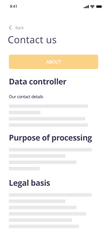
► Colors and contrast: it is important to ensure the legibility of textual information for people with disabilities by using appropriate color contrasts. Many tools for checking contrast are available online or as extensions to interface prototyping software.
Attention point
Possible approach

► Shapes and meanings: information is not conveyed solely by the content color, shape, size or position. For example, by indicating only by a red border around an input field that a mention is missing in a contact form that collects personal data, a person with poor colour perception could fail to perceive the information and be blocked in their journey. This information can be supplemented with explicit text elements and framed by <em>, <strong> or<span> tags.
► Images and multimedia content: for a good implementation of multimedia content, such as videos, text alternatives describing them should be provided. Images that carry information should have a detailed textual description in the alt attribute of the <img> tag in your html.
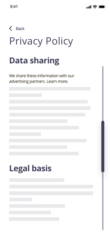
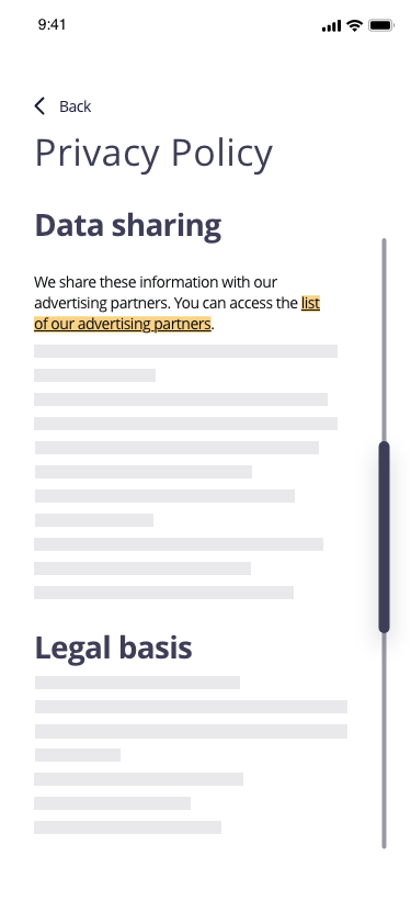
► Links: Links embedded in your service should clearly indicate where they lead. This means ensuring that the link text between the <a></a>tags in context (e.g. paragraph in which the link is found) makes it clear where it is going. This way, if the person is redirected to a third party site that involves new data processing rules, they can easily see this.
Attention point
Possible approach
► Browsing the service: your service has at least two of the following navigation systems: menu, search engine or sitemap.
► Responsive display: the content must be easy to consult on any type of device. Thus, it must adapt to the size and orientation of the screen. This is particularly important for certain elements such as tables.
► Information structure: information should use clear headings and be properly prioritised using <hx> tags.
Collecting consent
► Expressing a choice: in interfaces, choices are generally expressed through four types of elements: radio buttons, check boxes, push buttons and buttons. For each of these, the person must be able to easily understand which element is selected or clicked. For this, the aria-checked attribute is used to indicate the state of the element: true (checked), false (not checked), mixed (not determined).A textual content is systematically associated with it. The accessibility of these elements for all people is all the more important as it allows them to make choices and to go back on their decision without losing the thread of the actions carried out.
► Order of contents and options: : when the person has to make a choice concerning his or her personal data, this choice must be informed. Thus, care must be taken to ensure that tabbed navigation to the different elements of the page gives access first to the information elements and then to the associated choices. This is particularly important when using the specific pattern associating information and action. Furthermore, in the case of the collection of consent expressed by “I refuse” or “I accept” buttons which have a navigational effect, for example by closing a modal window as may be the case for cookie banners, care must be taken to ensure that the refusal option can be activated with the same degree of simplicity as the consent option. Thus, in view of the linear reading offered by screen readers, it is preferable to propose the refusal option first on reading, which makes its expression at least as simple as the expression of consent.
► Pop-up (modal window): In some cases, such as a cookie banner, a pop-up or modal window can be used to inform individuals and collect their consent for certain uses of their data. This type of implementation must respect several rules in order to be accessible. Thus, the tag containing the pop-up must have the attributes aria-label with the title of the modal as its value, role with the value dialog (indicates that the element is a dialog window in relation to the rest of the page content), aria-modal with the value true (indicates the presence of a modal to the screen reader and allows the reader to limit reading to this element of the page) and tabindex with the value -1 (allows the element to be selected first with a keyboard navigation by tabulation). When the pop-up opens, the focus can be on the most appropriate element of the modal, such as its title. Other spectifications should also be respected.
Exercising the rights
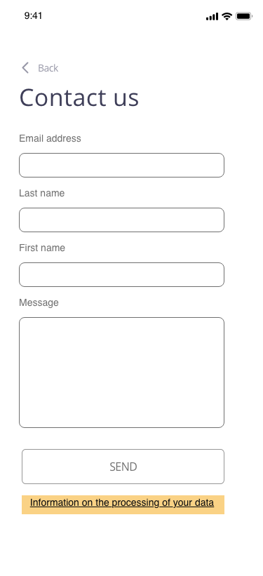
► Use of form: The GDPR information in a registration form should be included within the <form> tag of the forme. This allows it to appear before the registration completion button, including the link to the privacy policy. This is important because screen readers have a linear reading of the elements on the screen. Thus, if the information is outside the <form> tag and appears below the form validation button, people browsing with a screen reader will access the button before the redirect link to the privacy policy. It is therefore highly unlikely that they will be aware of the existence of this link to inform themselves before clicking on the button and registering for a service.
Attention point
Possible approach
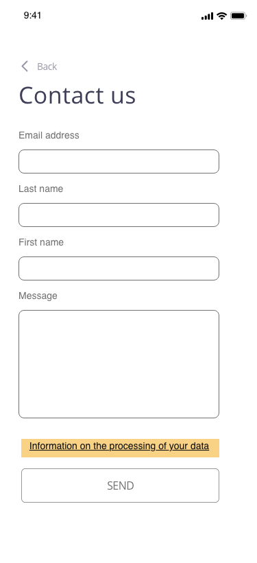
► Use of captcha : contact forms relating to the exercise of rights that include Captcha elements to prevent spamming may present problems of comprehension, for example for a dyslexic person, or of legibility.
Tips
► Attempts to integrate overlay tools that integrate with an existing site and promise to make a site compliant should be discarded. This type of tool cannot replace the expertise of a person who thinks about accessibility in terms of the project, particularly as it does not necessarily take into account all disabilities and may involve the deposit of tracers and cookies.
Further information
For more information and details on the implementation of accessibility, we invite you to consult the general accessibility guidelines (fr) for the accessibility of French public sites and services published by the Direction interministérielle du numérique, the accessibility guidelines for web content and the ARIA Authoring Practices Guide, both published by the W3C.
