This design pattern is part of the LINC’s research initiative focusing on interface design. It comes from frequent proposals made by participants of the Data & Design workshops to implement the principle of transparency provided in the GDPR. It can be used and adapted to the specific context of your services and products. However, its reuse as such do not guarantee compliance with the GDPR in general and the principle of transparency in particular.
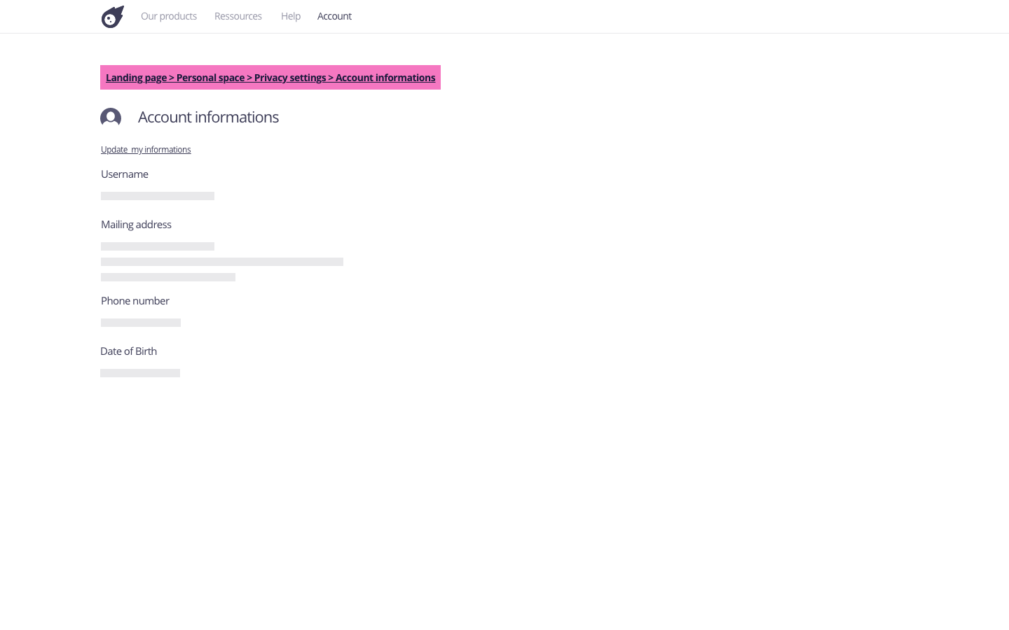
This pattern makes it possible to locate and visualise the navigation path that the person has taken. It thus indicates at which level the person is in the service structure. This pattern is a visual navigation marker that makes it easy to retrace the path when it is composed of several levels.
Using the pattern in the user journey
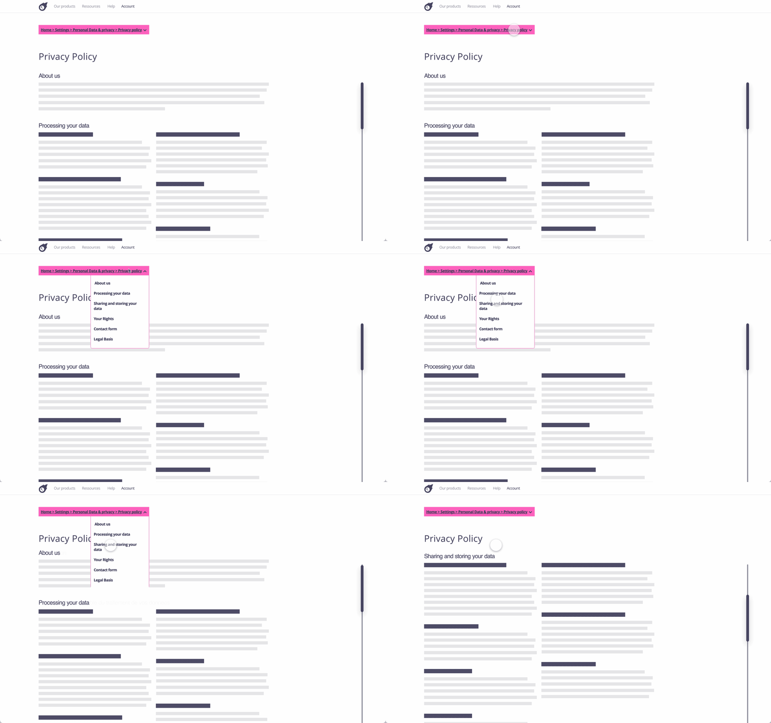
► In a privacy policy : If a breadcrumb is used in a privacy policy, it may include, at its end, the name of the section currently being viewed. The end of the breadcrumb is updated as you read and move from one section to another. It can also be clickable and display the titles of the parts that make it up by means of a drop-down menu. By clicking on a title, the person is redirected by an anchor to the corresponding part.
► When setting one’s preferences : if preferences are spread over thematic pages (e.g. use of logins, visibility of posts, use of browsing data), the breadcrumb facilitates the setting by allowing quick access to other settings, or to go back.
Tips
► The breadcrumb is designed to help navigation through several pages. To facilitate navigation within a single page, it is best to use a navigable table of contents.
► The page titles displayed in the breadcrumb must be clear and relevant, that means they must correspond to the pages they refer to.
► In order to facilitate navigation for people using a screen reader, it is recommended to tag the current page in a breadcrumb with the HTML attribute aria-current.
Examples
Possible approach

Possible approach (animation)


