Instap is a social network used daily by teenagers from 15 to 17 whom get together to share pictures, videos and message with their community.
This case study is part of a LINC research initiative focusing on interface design. Cases dealt with are fictional services co-created with the participants of the Data & Design workshops. The solutions considered here are not intended to be recommendations to copy, but rather contextual illustrations of creative processes that might inspire your services and products. The study does not cover the entire user experience, but simply concentrates on key points. As such, it does not necessarily cover all GDPR requirements.
This case study is the result of a co-creation process with about thirty children and teenagers, as well as their parents, which took place between October and December 2020. Focus groups were first carried out to understand and measure the minors’ use of digital tools and to assess their knowledge of personal data protection. Workshops with these minors were then conducted to design interfaces based on their experiences and daily uses. These interfaces were then tested with other children to get a first impression of their reception.
Product’s Context
Instap is a social network partly based on geolocation: it allows users to know where their contacts are and to automatically add their location to their posts. This data is also used to send personalised editorial content based on the user’s location, which for example allows to prioritize in the user’s feed contents posted by friends who are physically closest to them. The social network also offers a “ghost mode” that allows users to make their location invisible to their friends.
Geolocation is something that the teenagers in the focus group say they are careful about. While they are less concerned about sharing their photos with a wider circle of acquaintances, they say they prefer their geolocation to be shared with a few people. This is why teenagers appreciate this “ghost mode”. However, they forget or do not understand that the network can continue to access their location data, even when they think they have limited the visibility of their location through this type of mode.
In this context, how can minors be actively reminded of how they have set up the visibility of their location data and how they can further control it?
User pathway and key steps
Once the geolocation is activated on a smartphone by the user, its use in an application can be quite invisible to them. The permission to use this data by an application is usually given at registration – with a screen in which the information and purpose are specified – without the user being reminded of it afterwards. The teenagers participating in the co-design workshop therefore wanted to be able to go back to the settings during their use of the social network in order to make the geolocation status more visible. In particular, they were concerned about:
- being able to quickly set their preferences through a proactive information so that they don’t have to search for the information or the setting in the application. Indeed, the focus groups showed that minors are interested in personal data provided that the information is pushed to them and that it fits seamlessly into their use of digital tools;
- the clarity of the potential actions, by associating concise information with a precise action as well as by informing about the consequences of a choice.
Quick & Clear
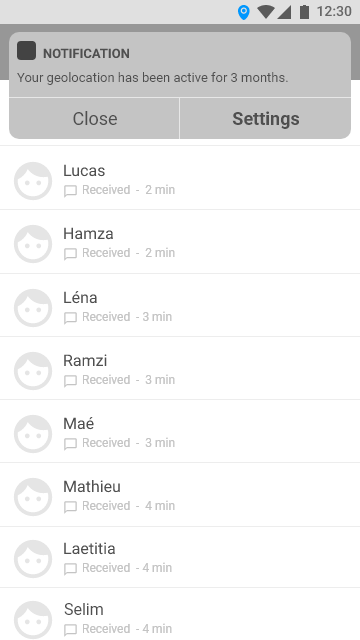
To stick with the interface and interaction elements usually implemented in social networks, the participants in the co-creation workshops suggested using notifications to remind them punctually that the geolocation is activated.
In addition to the active provision of information, the minors wanted to be able to directly act on it through action buttons. The information is thus directly linked to an action.
Proposed Approach

The scope of choices
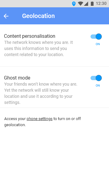
This logic of linking information to an action can be found on the interface dedicated to setting the parameters for sharing geolocation. During the co-creation workshops, presenting the information and the means of action on a single page emerged as an essential criterion to facilitate the exercise of rights by minors. Thus, the two setting options – whose status is indicated by push buttons following the usual interface design codes – are explained in short paragraphs highlighting key points (such as who will have access to the location). Teenagers insisted that this information should best reflect the consequences of their choices, with a clear explanation of how their data will be used.
Teenagers also indicated in the focus groups and workshops that they preferred to be addressed in a ‘first name’ manner. Combined with a direct style, it makes it easier to understand the consequences and scope of their choices. Organising the information in short and distinct blocks also helps minors to understand it.
Proposed Approach

Limitations
The tests conducted with five teenagers aged 15 to 17 showed that the information provided was clearly understood and that the proposal was highly acceptable: the teenagers were particularly receptive to the “alert” effect of the notification, which made them aware of the possibility of returning to the settings after having completed their registration. However, larger-scale tests would be needed to assess the concrete impact of this design on teenagers’ control of their data. Care must also be taken to not overload users with notifications asking them to (re)set their preferences, at the risk of creating “settings fatigue”.
