Fuzzy is a smartphone manufacturer that aims to compete with more traditional players. To achieve this, the brand bets on simplicity with a streamlined interface and on the transparency of the processing of personal data.
To find out more and take part in discussions within the community on the subject, don’t hesitate to join us on our dedicated Slack channel!
This case study is part of a mediation effort by the LINC on the design of interfaces. It translates in the form of a fictitious service decisions made by the CNIL in order to make them clear and accessible. It illustrates breaches of the General Data Protection Regulation (GDPR) identified by the CNIL in the design of user interfaces and user journeys, in order to avoid them in your products and services. The study does not address an entire user journey of a product or service and focuses on certain aspects. As such, it does not necessarily cover all the requirements of the GDPR.
Service Context
Fuzzy, a rising smartphone manufacturer, is launching its own operating system. By default, the company installs its native applications on the phones, some of which requiring the creation of a FuzzyConnect account. This account promises easy and intuitive management of the phone and of the associated services using a single login. By proposing to use only its services, the manufacturer aims to create a seamless experience of its services with a uniform user experience. Its ambition is to divert consumers from the more traditional players. Fuzzy is also banking on the transparency of the processing it implements and on giving users control of their data to attract and retain customers. All these measures are put in place to gain the trust of users.
However, after a rather convincing launch, the brand quickly attracted criticism as to its promises. Thus, an overall lack of transparency towards its users, sometimes leaving them particularly confused about the processing of their personal data and the protection of their privacy, has been criticised by many digital stakeholders. In this context, what are the practices implemented by Fuzzy that do not provide enough transparency on its processing, and more broadly, do not comply with the GDPR?
User journey and key steps
Initialising a phone requires users to set their preferences regarding the collection and use of their personal data. These initial interactions with the phone are crucial for users to comprehend the information on their personal data and understand how the different settings impact their processing by the smartphone, and by extension, by the applications installed on it. If this information is not clear or accessible, it is easy for a user who are in a hurry or are inattentive to miss important points. In this respect, the General Data Protection Regulation (GDPR) defines criteria for concise, understandable and accessible information for all.
Some practices used for the configuration of a phone may lead to GDPR breaches, for example by not allowing individuals to be fully informed about how their personal data will be processed. These may include:
- situations where users are incited to share personal data by influencing the user to express consent or to create an account;
- a lack of clarity in the information provided. If the user is not able to understand the information given, they can neither exercise their rights nor understand the impact that the processing may have on their privacy;
- overall lack of accessibility to information concerning the privacy of the individual through a complex architecture of interfaces and user journey.
Incentives to share data
In the first steps of the smartphone setup, the user chooses whether or not to create a FuzzyConnect account. The interface prompts the user to create it by using a green button that is clearly distinguishable from the other visual elements of the interface. Conversely, the option to skip this step is available at the bottom of the screen via a button with no background color and with the text in the same light grey color as the text body.
If the user chooses to ignore this account creation by clicking on the corresponding button, a window questioning their choice opens. In this window, arguments are put forward indicating that certain features of the phone will not be available without an account. Only emphasising the negative aspects of such a choice, this approach may encourage the user to share data: the text specifies that not all features and applications will be accessible without this account, but does not give any information about the number of applications whose access will be affected. The information is neither clear nor exhaustive in this respect. Indeed, there is no indication of whether or not basic smartphone applications such as calendar, documents, emails, notes or even calls will be accessible. Despite this warning, the user refuses to create an account.
Focus of attention

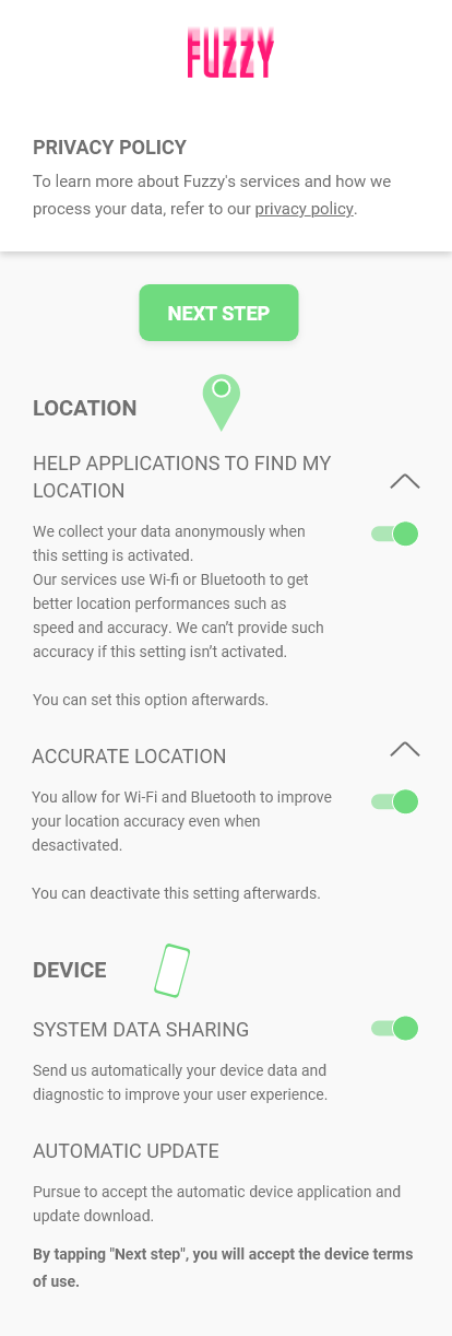
A little later in the phone’s configuration phase, the user is offered some settings concerning the use of geolocation by Fuzzy services. Without any prior action from the user, the associated settings are pre-selected. Moreover, a follow button is conspicuously provided at the top of the screen, inviting the user to immediately click on it. By this practice, Fuzzy’s designers know that the likelihood of the user continuing without changing the settings is higher: when choices are pre-selected or checked beforehand, the user tends to keep that default state as it requires less effort from them. This principle is more commonly known as the ‘default effect’. However, in this case, it means that the user would not be aware of the information about the use of geolocation but would still “consent” to its use by Fuzzy. Consent collected in this way could not be considered as free, informed and voluntary and is therefore not in line with the principles set out in the GDPR.
Focus of attention

Unclear information…
After initialising their phone and realising that several functions are not accessible to them, the user finally takes the initiative to create a FuzzyConnect account in order to be able to use all the functions of the phone. As part of the account creation process, the user is directly offered first-level information (purposes of the processing, identity of the data controller, description of the rights of the data subjects and reference to the privacy policy) relating to the processing of their personal data associated with the Fuzzy services, among which those for which a FuzzyConnect account is required. However, as written, this first level does not allow them to clearly identify the purpose of the processing, nor to understand the effects on their privacy. Indeed, while they are able to know that processing will take place – “We process data generated by your activity” -, the purposes mentioned – “We do this to: carry out personalised advertising” -, remain vague and do not reflect the massive and intrusive nature of the processing. The user can neither know who will have access to his data and why, nor can they measure the possible impact on their privacy.
Focus of attention

Wishing to better understand these possible impacts, they consult the second level of information on the processing, namely the privacy policy. Here again, the information remains generic and does not shed the expected light on the scope of the processing of their personal data and its consequences. For example, phrases such as “We store the data provided at the creation of the FuzzyConnect account”, “We store the data generated by activities related to the services offered by Fuzzy” or “We use your personal data according to your mobile usage” are present. While the processing concerns many aspects of one’s private life based on data from a wide variety of sources, the information available does not allow the user to clearly identify the degree of intrusion into their private life because it is too imprecise and lacks clarity. Indeed, the search history may accurately reveal sensitive data, such as political opinion or personal beliefs, the location may reveal travel habits, etc. Furthermore, the information provided does not give any granularity on the data used for the functioning of each service: it is not specified whether geolocation is used for browsing only or also for photos or associated with the account itself and used in all services (app shop, web browser, third-party apps, etc.).
The GDPR requires that any information about the processing of personal data to be complete, understandable, simple and clear. It must enable the data subject to understand how his personal data will be processed, the scope of the processing and how to control his data. The European Data Protection Committee recommends in particular to provide information in layers which allows on the one hand to have information adapted at the right time and on the other hand to have, if necessary, a complete information. The information set up by Fuzzy does not allow for this and therefore does not meet the principles of clarity of information and transparency of processing required by the GDPR.
… and difficult to reach
As the user continues to search for information, they face difficulties in finding and collecting all of it, in order to reach the desired level of information and to be able to manage their data. For example, to manage the use of geolocation data, several paths are possible.
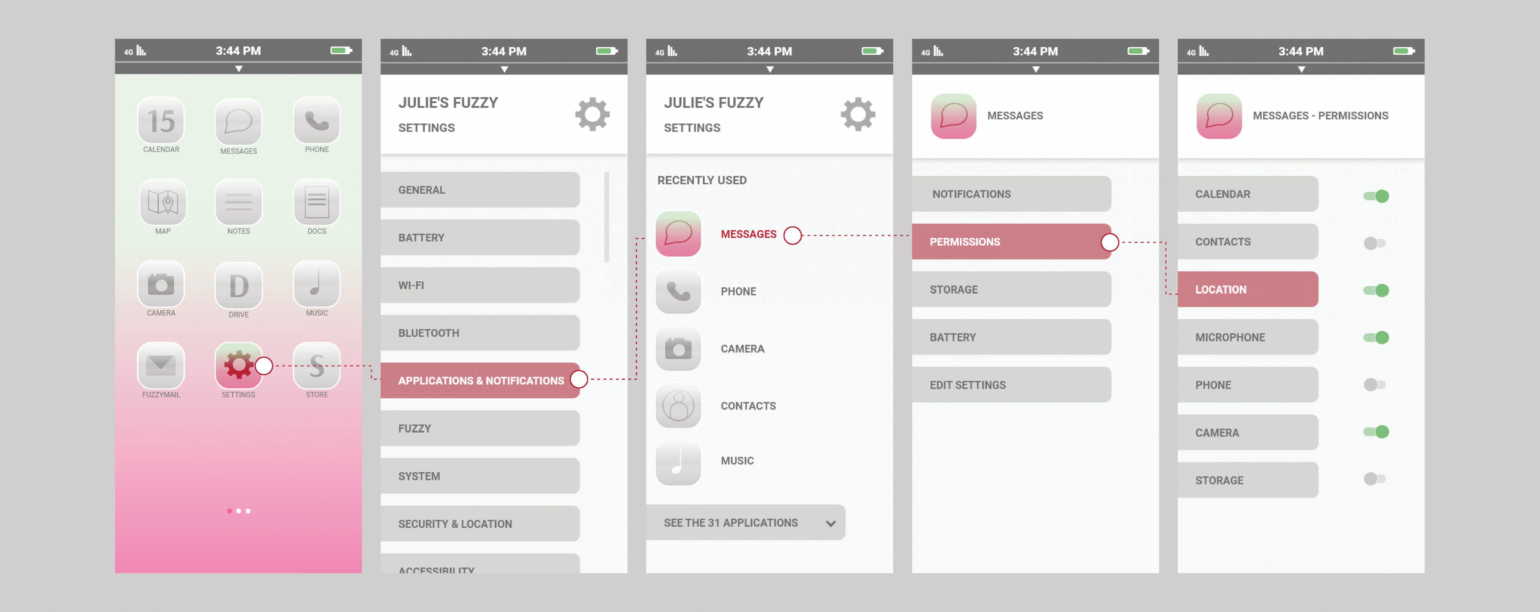
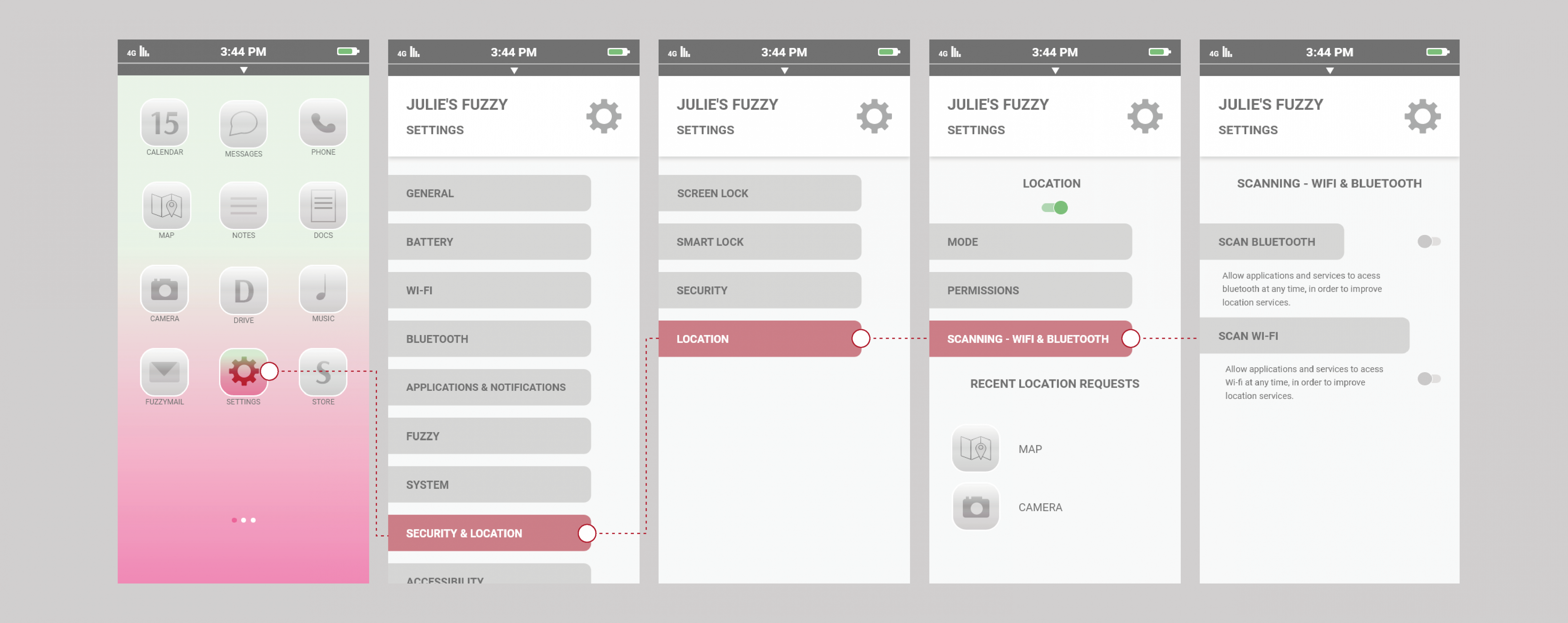
The two paths below, which do not represent all possible scenarios, show the extent to which the information or means of managing one’s data are scattered within the interfaces and require numerous interactions before the desired one is reached. Finding all the information related to one aspect of processing or ensuring that one of one’s data processing preferences is properly reflected in all the processing is particularly difficult because of the complex and numerous access paths.
Focus of attention

Focus of attention

Thus, in the first path shown, five consecutive clicks are required to find out whether localisation is activated for a specific application. For the second path, four clicks are required to find out if it is active in general. Another level of information is Thus, in the first path shown, five consecutive clicks are required to find out whether localisation is activated for a specific application. For the second path, four clicks are required to find out if it is active in general. Another level of information is available after this step and concerns the use of Wi-Fi and Bluetooth to improve location accuracy. As can be seen, the information is fragmented at several levels, not centralised, which makes it particularly difficult to access. It is almost impossible for the user to ensure that they have checked all the places where they set their preferences for geolocation use. Moreover, at no point can the user assess the purpose of the data processing or the relevance of accessing this information in a particular service.
The multiplication of necessary actions does not meet the requirements of transparency and accessibility of information and shows an overall lack of accessibility, not respecting the principles of the GDPR. In order for the user to be able to easily and intuitively find the information he is looking for regarding his data, the information access architecture must be designed to minimise the number of clicks required to obtain information or an action related to his data. Therefore, the information provided to the individual should not be scattered or fragmented in several places within the service or a user journey to provide the information.
Conclusion
The multiplication of necessary actions does not meet the requirements of transparency and accessibility of information and shows an overall lack of accessibility, not respecting the principles of the GDPR. In order for the user to be able to easily and This case study illustrates concrete non-compliance situations by showing some of the dark patterns that can be used in user interfaces and user journeys. Here, these practices seek to hide information, for example by making it accessible only after many clicks, or to influence users’ choices by using pre-ticked boxes for the collection of consent. It thus shows that a user journey can be complicit in failing to comply with the clarity and transparency requirements of the GDPR by creating, among other things, defects in the clarity and accessibility of information.
The multiplication of necessary actions does not meet the requirements of transparency and accessibility of information and This illustration concerns both designers and users, the former for implementing future interfaces that are respectful of privacy and data protection principles by understanding what may be non-compliant, the latter for understanding their rights and identifying illicit situations in their own digital experiences.
