Brawl Crush is an online mobile game popular among the 8 – 10 years old. They share messages during the game and discuss it at breaks.
This case study is part of a LINC research initiative focusing on interface design. Cases dealt with are fictional services co-created with the participants of the Data & Design workshops. The solutions considered here are not intended to be recommendations to copy, but rather contextual illustrations of creative processes that might inspire your services and products. The study does not cover the entire user experience, but simply concentrates on key points. As such, it does not necessarily cover all GDPR requirements.
This case study is the result of a co-creation process with about thirty children and teenagers, as well as their parents, which took place between October and December 2020. Focus groups were first carried out to understand and measure the minors’ use of digital tools and to assess their knowledge of personal data protection. Workshops with these minors were then conducted to design interfaces based on their experiences and daily uses. These interfaces were then tested with other children to get a first impression of their reception.
In particular, the workshop in this case study did not explore in detail the ways in which parents can be involved in the registration process, which is required for this age group, and which may call for complementary modes of interaction between children, parents and the application.
Product’s Context
Brawl Crush is an online puzzle game with cooperative and competitive modes that is very popular with 8-10 years old. Available only on mobile, its simple game mechanics, graphics and iconic character Theseus have captured the hearts of children. In order to play Brawl Crush, children, with the consent and participation of their parents, must create an account which is, among other things, used by the game to allow them to meet and play with friends.
In the context of registering for a service, the focus groups revealed a gap between the understanding and the perception of reality. Children aged between 8 and 10 think they have mastered the registration process, whereas in reality they find it difficult to grasp the notion of a company collecting their data and using it. Their control is therefore limited.
In this context, how do you create a registration form that is quick and engaging, while making parents and children understand what data is being collected about them and giving them a simple way to control it?
User pathway and key steps
Often, an identification or registration step is required to access and play a game. Although children generally want to get through this stage as quickly as possible in order to play, registration is a key moment for informing the child and their parents about the treatment of their personal data. To make it more attractive, the workshop participants imagined transforming the registration form into a playful moment, just like the game experience itself. The aim is to create the necessary engagement so that children will want to take a few minutes to read the information about their personal data, understand it and then, together with their parents, make a decision about the processing of their data.

This approach led participants to explore three aspects of the registration form:
- a step-by-step enrolment pathway for each datum and its associated choices to allow children a simple association between a datum and its control;
- simplified wording for the information provided to avoid any overload that would discourage children from reading and finding out more;
- graphics and tone adapted to children while avoiding the pitfall of infantilizing visuals or words to make children responsible for their choices.
One datum, one request
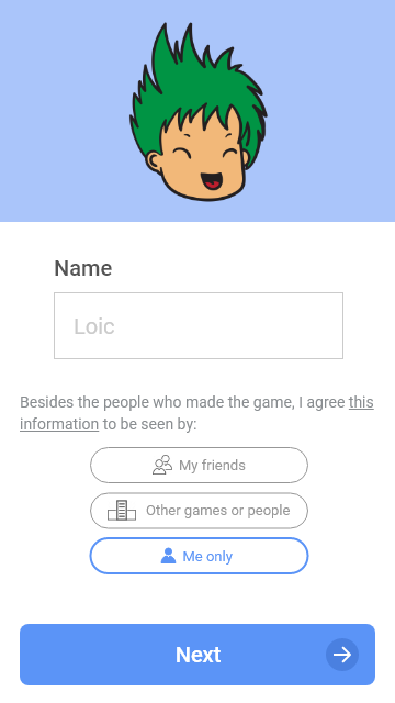
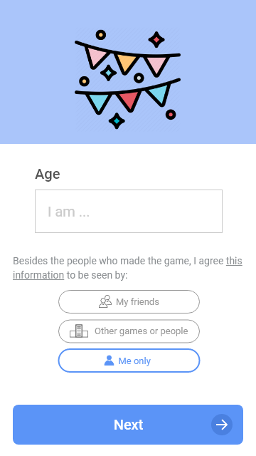
The registration form collects two pieces of information: the child’s first name and age. Faced with this limited amount of information to be entered, the participants imagined during the co-creation workshop a pathway associating a piece of data with the setting of its visibility: each time the child enters one of his or her details, he or she can click on a button to say who can see it. Prior to this setting, a screen clearly and succinctly presented the purposes for which these two pieces of information are used, such as having one’s first name displayed in the game’s ranking table.
The direct association between the data and its visibility to others is particularly easy for children to understand and allows them to express their preferences clearly and quickly, while being aware of the uses made of the data. To make it easier to read the display options, the participants chose to always use the same type of presentation for them by positioning and formulating the buttons in the same way. Furthermore, in an effort to respect the privacy of the child by default, the option that is most protective of the child’s privacy “Only me” is pre-selected.
Proposed Approach

Information frugality
During the user tests, it was noted that the information overload was particularly detrimental to the reading of minors, especially if they were in a hurry to access the content of the application (in this case the game). It was therefore decided to display only a small amount of text on each screen, associated with very explicit and visible buttons. This choice was accompanied by special work on the words to make the terms understandable. The wording is intended to be concrete, referring to environments and concepts known to children. For example, the company developing the game is referred to as “the people who created the game”, which is more meaningful to children. The option to make the information publicly visible is called “Other games or people”, both of which give substance to the notion of information being public and visible to all.
Nevertheless, in addition to the information provided before the setting, full information is readily available if the child or his/her parents wish to learn more. For example, they can click on the “this information” link to get more details about the data entered through an anchor link in the privacy policy that has been specifically designed to be read by children.
Proposed Approach

For kids but not infantilising
Illustrations can be an effective way of conveying information to children. The participants first thought of creating a dedicated graphic universe for information on data protection. The idea of a “cute squirrel” as a data protection mascot for young children was rejected from the outset by them as being too childish and unrelated to the game Brawl Crush. This awareness of the possible rejection by children of representations that are too childish or disconnected from the context of the service prompted the group to use illustrations that echoed the visual and graphic style of the game. This approach has the advantage of keeping the same visual reference for users, bringing an overall consistency to the user experience.
Proposed Approach

Limitations
This very progressive and didactic proposal was generally well received by the 11 children who tested the interface. The information-action coupling was particularly well received, but the question arises as to how it works in more complex cases, particularly when consent is required for the re-use of data by the company or a third party. Furthermore, the role of parents in this process should be studied and explored in greater depth, as their consent is required: children aged between 8 and 10 must be accompanied by a parent to register for an online service.
