This design pattern is part of the LINC’s research initiative focusing on interface design. It comes from frequent proposals made by participants of the Data & Design workshops to implement the principle of transparency provided in the GDPR. It can be used and adapted to the specific context of your services and products. However, its reuse as such do not guarantee compliance with the GDPR in general and the principle of transparency in particular..
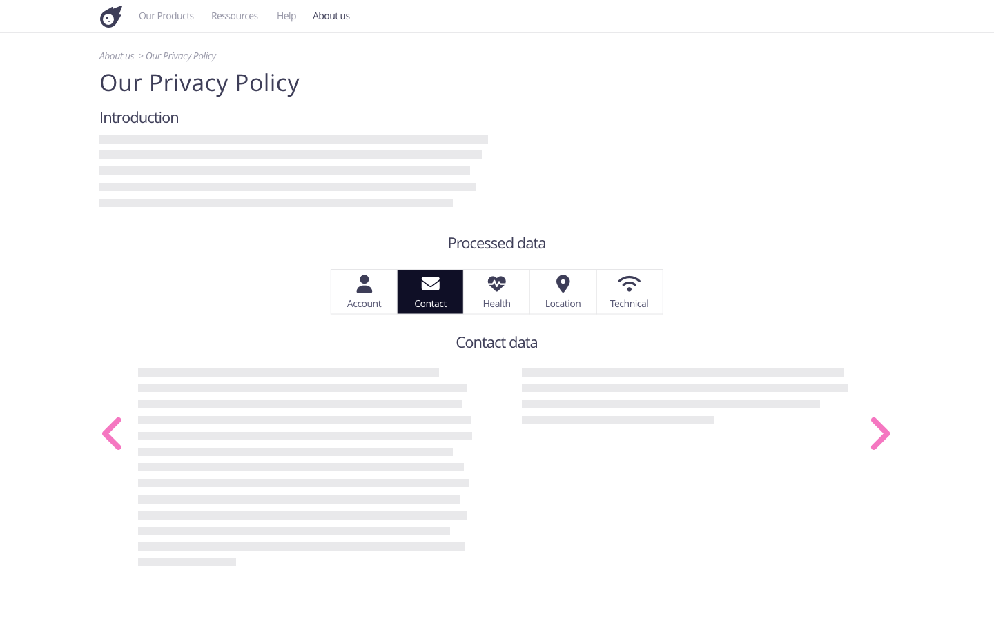
This pattern allows to navigate between different sections, whether they are on the same page or on different pages. The browsing arrows thus offer a sequencing of the navigation and complement other ways of navigating between sections.
Using the pattern in the user journey
► When signing-up : when registration is done through several screens, the browsing arrows are relevant to allow people to go back. They may wish to change a choice they have made, modify information they have entered previously, or consult information they may have missed.
► In a privacy policy : this pattern allows the user to move from one part of the policy to another. Coupled with a navigable table of contents, which keeps an overview of the policy, this pattern makes it possible to scroll through the sections one by one without having to scroll manually.
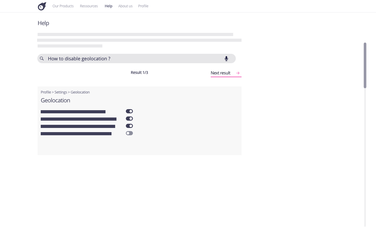
► In case of a problem with data or its use : this pattern allows the implementation of a navigation thread for the results given through a search, which avoids going back and forth between the list of results and the pages associated with the results.
Tips
► The use of this pattern should not condone or encourage the dissemination of data protection information and settings across multiple pages.
► This pattern may provoke the multiplication of clicks to find information. To avoid this, it should be used in addition to more direct means of navigation, such as a navigable table of contents or fixed elements added to the structure.
► The design of this pattern must take accessibility into account. Thus, the arrows must be visible : neither too thin nor too clear and be readable on all screen formats. Furthermore, the use of icons alone can be confusing for some people who are not very comfortable with digital technology, as their meaning is not clear enough to make the pattern easy to understand. In this case, the arrow can be attached to a text explaining its action (such as “next result”).
► This pattern is based on the use of javascript. Some scripts are not readable by all browsers, or are even deactivated by some Internet users.
Examples
Possible approach

Possible approach


